
Organizations can now easily design and deploy a machine learning model for their business needs, utilizing a low-code no-code technique in a few clicks. But what about explaining these models? The models might have hundreds or more parameters within complex decision functions which are humanly impossible to understand on their own. Thus we tend to use XAI (eXplainable AI) techniques to understand their decision-making process.
Explaining models is an in-demand skill now thanks to some new regulations currently being drafted, such as the White House AI Bill of Rights Blueprint and the AI Act by the European Commission. The goal is to make organizations responsible if they deploy a rogue model they did not spend time understanding.
This applies to a number of industries (healthcare, the supply chain, manufacturing, ...), but here we will focus on retail. There, models are optimized to predict consumer preferences to ensure operations run as expected and sales are maximized.
In this article, we are going to train a regression model to predict a retail chain’s sales, product by product and store by store. Then we are going to explain it. Firms could follow this approach when answering questions such as "If I increase the price of a product, does the model predict more or fewer sales? Is this expected?" or “On average, how would changing this price feature affect all products over all stores? How does it affect a single product of interest?” and so on.
We need two XAI (eXplainable AI) techniques:
-
Individual Conditional Expectation (ICE): This is a local technique which has one line per instance that shows how the target value of that instance changes when feature value is changed
-
Partial Dependence Plot (PDP): This is a global technique which shows the dependency between one or two features on the target value. This does not depend on a individual instance, but on overall average
The Theory Behind Individual Conditional Expectation (ICE) and Partial Dependence Plots (PDP)
An Individual Conditional Expectation (ICE) plot showcases how a feature influences the final prediction for each instance. Thus the plot has one line/curve per instance. The steps for calculating ICE values for each instance i with n instances in our validation or test set are as follows:
-
Select the feature S, for which ICE needs to be calculated, and consider its domain: [ lS, uS ], where lS is the lower bound and uS is the upper bound.
-
All the other features will be kept in the set C.
-
Select the instance i and take the vector with all the features: S and C, such that
x ⁽ⁱ⁾= ( xS ⁽ⁱ⁾ ,xC ⁽ⁱ⁾ ). -
Create k samples by changing the value of xS ⁽ⁱ⁾ within the domain [ lS , uS ], while keeping all the other features C at their original values. After sampling, you should have k samples such that:
xj ⁽ⁱ⁾= ( xSj ⁽ⁱ⁾ ,xC ⁽ⁱ⁾ ) with xSj ⁽ⁱ⁾ ϵ [ lS , uS ] and j ϵ [ 1, k ]. -
Score these samples using the black box model f(x) that needs to be explained. This results in k predictions, such that:
f ( xj ⁽ⁱ⁾ ) with j ϵ [ 1,k ]. -
Repeat the process for all desired instances i with i ϵ [ 1,n ]. Usually those are all the instances in your validation or test set.
-
For each instance, you can plot a line where on the x axis you plot xSj ⁽ⁱ⁾ ϵ [ lS , uS ] and f ( xj ⁽ⁱ⁾ ) on the y axis. If the model is a classification model, the y axis domain should go from 0 to 1 as you are plotting a probability. If the model is a regression model, the y axis domain can be of any range.
Repeat the last step for all the remaining instances; the final plot will contain one line for each instance. The ICE plots are at the granular level, which shows how the prediction of individual instances changes when the selected feature changes. But it doesn't explain anything about the entire model in the global level. This can be achieved with the help of a Partial Dependence Plot (PDP).
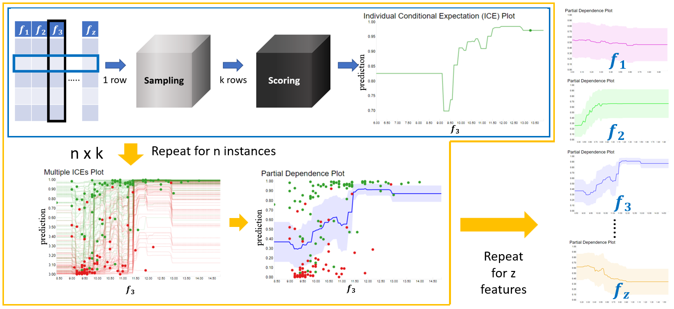
The PDP shows how the model’s prediction partially depends on the input feature of interest. PDP visualizes how the change to the selected input feature affects the prediction of the model on overall average. This can be calculated by taking the average prediction for all instances for all values within [ lS , uS ]. This can be represented mathematically in the Monte Carlo method as:
fS( xj) ≅ gS( xj ) = 1/n Σi f ( xSj , xC ⁽ⁱ⁾ ) with xSj ϵ [ lS , uS ] and j ϵ [ 1, k ]
-
The above-mentioned partial dependence function, gS ( xj ) approximate fS ( xj ), is how the model behaves scoring a particular value for the feature S. Given that we are considering only the feature S, that is called the marginal effect on the final target.
-
xSj represents a particular value(s) of the feature of interest. To cover the full domain of S, we have k samples. As j ranges between 1 and k, then xSj ϵ [ lS , uS ].
-
xc ⁽ⁱ⁾ represents the values of the remaining features in our dataset. These were not samples, so they will stay fixed to the original values in our test or validation set.
-
n is the total number of instances in our test or validation set.
One of the assumptions made when calculating PDP/ICE is that the features in C and S have no correlation. If this assumption is violated, the graph might show values which are unlikely to be obtained.
The PDP and ICE plots for Classification will show the probability of an instance falling into a specific class given different values of feature(s) in S. When it comes to multiclass classification, one plot per class is ideal. In the case of Regression, the plot would show the predicted output value based on the feature(s) values in S.
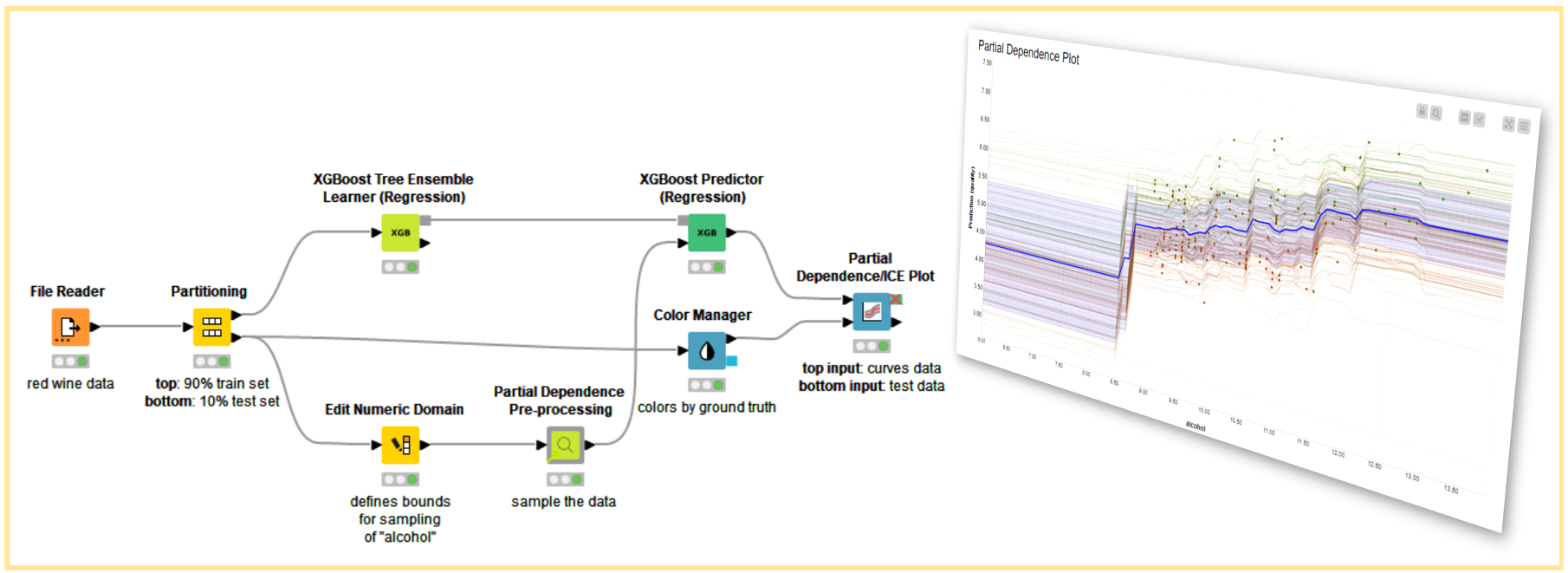
How to Compute PDP and ICE in KNIME
The PDP and ICE graphs can be obtained in KNIME with drag-and-drop operations for both Regression and Classification settings. The sampling described in Figure 2 is implemented by the Partial Dependence Pre-processing verified component, and the graphs are generated using the Partial Dependence/ICE Plot node. In the next section, we will go through how to implement the PDP and ICE techniques using the Partial Dependence Plot with AutoML (Regression) workflow as an example.
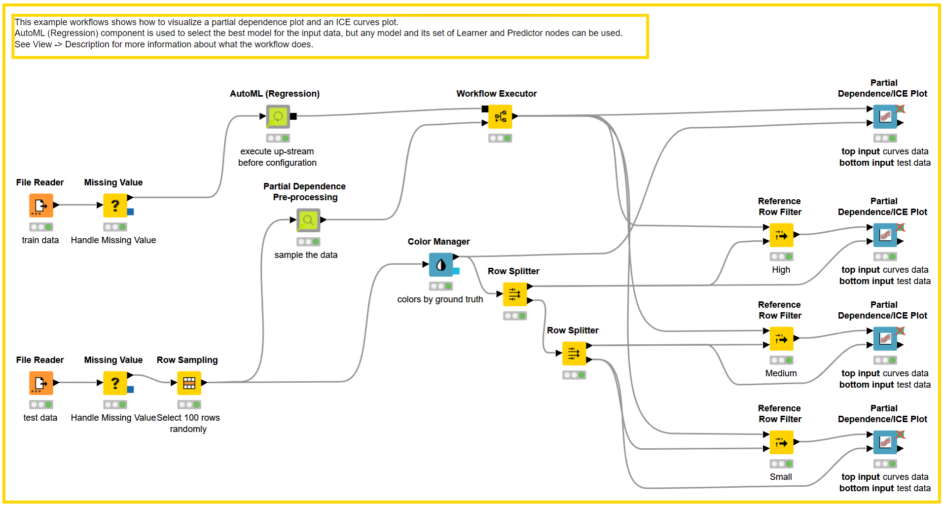
We choose “Big Mart Sales Prediction Datasets” to illustrate the PDP and ICE technique, which consists of labeled training dataset and unlabeled test dataset. The dataset consists of sales data for 1,559 products from ten stores, with six categorical and four numerical features. The amount of a particular product sold at a specific outlet is the target.
The training dataset is loaded into AutoML (Regression) Component, which trains various regression models and chooses the best one based on the evaluation metric. In our example workflow, the Partial Dependence Plot with AutoML (Regression), we adopted the Gradient Boosted Trees Learner (Regression) node to train a model with acceptable Root Mean Square Error (RMSE). To be explained using PDP/ICE graphs, 100 instances from the test data set are selected with stratified sampling on the “Outlet Size” feature, which has three values: “Small”, “Medium”, and “High”.
To reference some of the notation from previous section, please consider:
-
S = “Item_MRP”, the feature that is selected to partially explain the black box model using PDP/ICE plots
-
[ lS , uS ] for “Item_MRP” (S) is [31.99,264.24], where lSis the lower bound of S and uS is the upper bound of S
-
k = 100, where k is the number of samples to be generated within [ lS , uS ] for each instance in the test set
-
n = 100, where n is the number of instances selected from the test data set to validate the black box model
-
f(x) is a gradient boosted tree, our black box model
To create 100 samples, each of the selected 100 instances are passed to the Partial Dependence Pre-processing Component. The component can be configured as follows:
-
Selected Numerical Features - Select all of the numerical features that must be explained using the PDP/ICE graph (categorical feature is not allowed at the moment).
-
Number of Samples (k) - For each numerical feature chosen, it will generate k samples within its lower and upper bounds per instance while leaving the other feature values unaffected. Increasing the number of samples would provide a more nonlinear graph.
The Partial Dependence Pre-processing Component will generate 100 * 100 samples per numerical feature selected, based on the numerical features (n) and number of samples (k) selected. The black box model predictor is then used to score the Samples table.
The scored samples are then used to generate PDP and ICE plots with the help of the Partial Dependence/ICE Plot Node. The node has two inputs:
-
Sampled Predictions Table - The output of the Partial Dependence Pre-processing Component passed through the black box predictor node.
-
Original Data Table - Instances from the test data set selected to validate the black box model.
After passing the input tables, the node can be configured by correctly selecting Numerical Features sampled by the Partial Dependence Pre-processing Component and Prediction Columns generated by the black box model predictor
The graph will generate one ICE line for each sample chosen (in our case, 100). These values are then averaged across different values of selected k samples to generate the PDP plot. A different graph is generated for each numerical feature selected to be explained. Along with the mandatory selections, you can assign a specific color, line thickness, and so on to the plot to make it look nicer.
Visualization Examples
To better understand the PDP/ICE plots, we plotted how an item's Market Retail Price (MRP) affects sales in a specific outlet, seen in Figure 4.
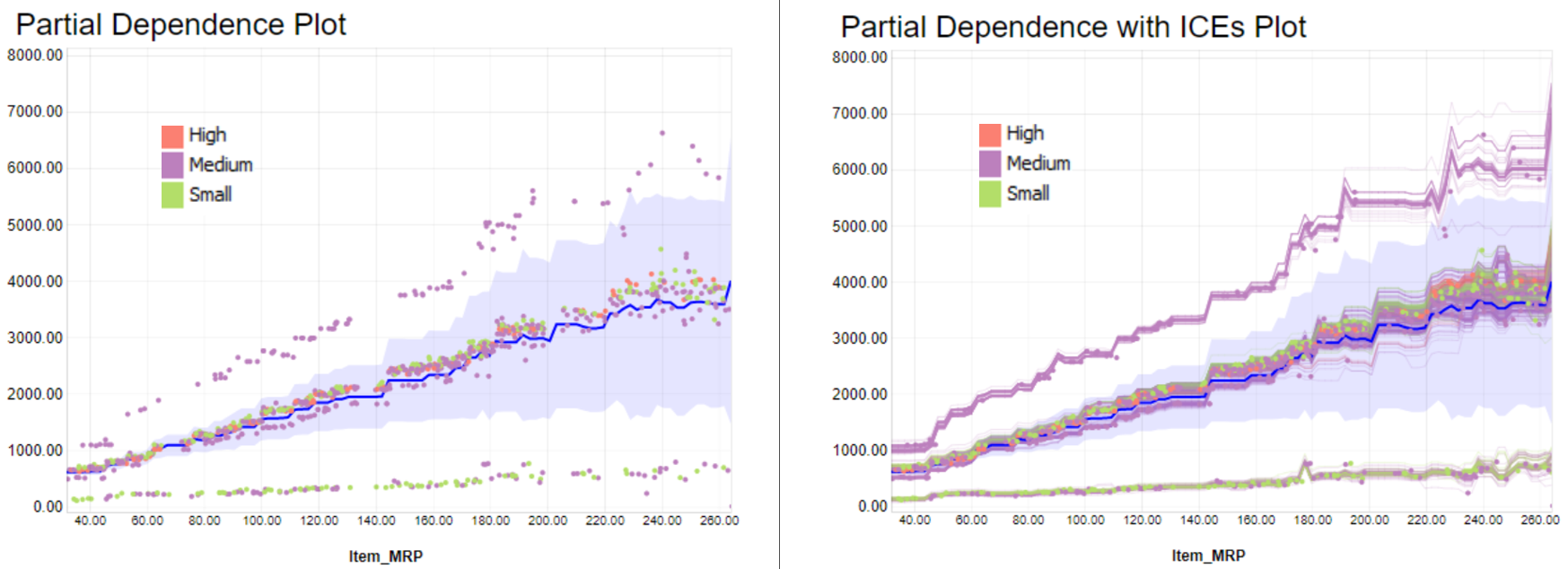
You can see the overall behavior of the PDP on the left. The behavior suggests there is a growing trend between the price feature (MRP) and the sales prediction. This rule, describing the model and not the reality, might be biased by the data we trained the model with. It is ultimately how the model is performing on this sample of instances.
On the right we display the same PDP plot with the ICE curves. We can see that some curves match the overall trend of the PDP plot (in blue). Some other instances at the bottom and top of the PDP trend demonstrate where predicted sales trends change when changing the price.
To investigate further, we color-coded each ICE curve depending on outlet size: Green for “Small”, purple for “Medium”, and red for “High” sizes. We see in the ICE plot how these colors cluster in different trends. We decide then to plot in three different charts each category (Figure 5).
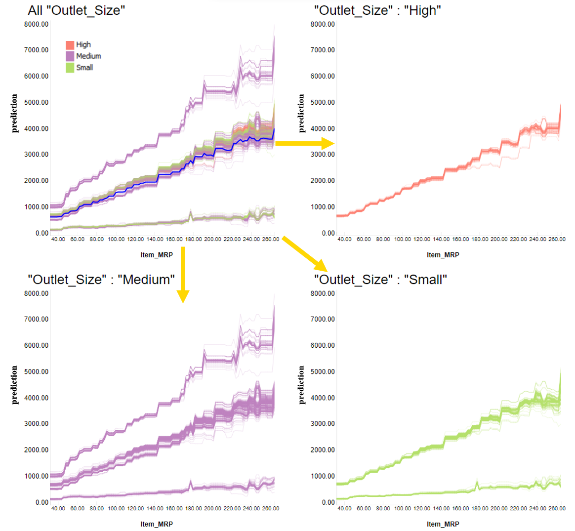
We see that for large outlets (top right corner), the ICE lines have a similar behavior when changing the price (MRP), all matching a steep trend. In the case of medium outlets (bottom left corner), we have a cluster of items with even steeper trends, as well as clusters with basically flat trends. For small stores (bottom right corner), the trend varies even more item by item.
As we can see, the predicted trend (based on how sale prediction and price increase together) varies by instance (that is, by store item), but overall trends valid for more than one item can be found by partitioning by an important feature, such as the size of the store.
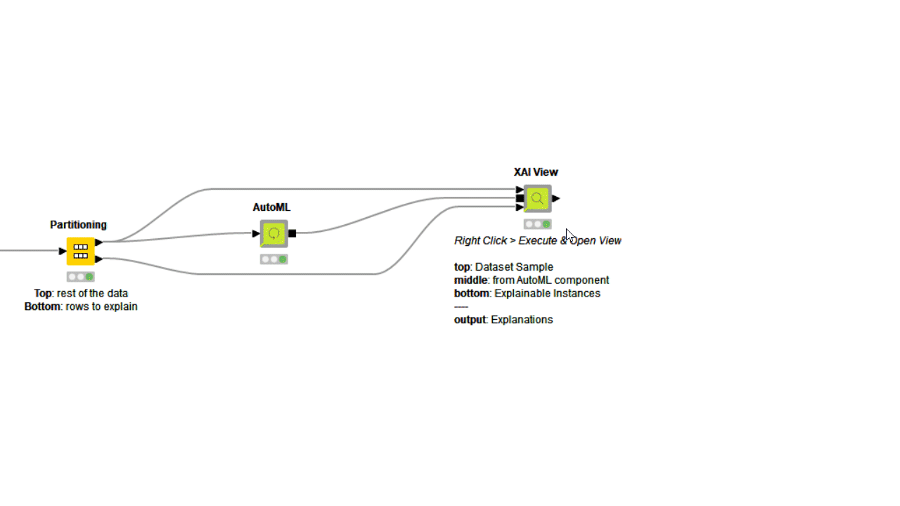
To investigate even further, you can use the PDP/ICE plots in combination with other XAI techniques. The XAI View Component with AutoML workflow demonstrates how SHAP explanations, PDP/ICE plots, and a surrogate decision tree model are computed and visualized in a composite interactive view for classification models. Find more about the XAI View component in the KNIME Blog “Debug and Inspect your Black Box Model with XAI View.”
Conclusion and Answers to How Model Explains our Example Questions
In the post we discussed PDP/ICE plots, one of the XAI techniques used to explain a black box model in a global/local manner. We began with the basic theory behind the technique, then demonstrated how to easily implement it in KNIME with the Big Mart Sales Prediction Dataset, and used plots to comprehend the black box model.
Earlier we asked three example questions:
-
"If I increase the price of a product, does the model predict more or fewer sales? Is this expected?"
Figure 4: The model always predicts more sales when the price (Item_MRP) increases. This might not confirm the reality of retail experts, and it might be worth training a different model that behaves in line with their expectations. -
“On average, how does changing this price feature affect all products over all stores?”
Figure 4: On average, we can plot a curve to show the global behavior (in blue). For example, this curve tells me that with an item with the price of 40 dollars, you get on average around 500 dollars in sales. On the other hand, with a price of 250 dollars, you get on average 4,000 dollars in predicted sales.
-
“How does it affect a single product of interest?”
Figure 5: Each product will have a different curve, but they all match an overall positive trend with different slopes. The different types of slope are partially connected to the size of the store (“Outlet_Size”).
A similar approach could be adopted to explain a retail sale prediction model in a real scenario.
Explore More Codeless XAI Solutions
KNIME Analytics Platform offers many codeless solutions to train and also explain the predictions made by a complex machine learning model, also called a black box model. To find out more about different XAI techniques, along with examples, check out the KNIME XAI Space, which is dedicated to various ML algorithms for Regression and Classification setup. The space is summarized in our blog post “Let KNIME Explain with XAI Solutions on KNIME Hub.”